Home Accessories

FINISH

RECKITT BENCKISER PRODUCT

RECKITT BENCKISER PRODUCT

GLOBAL RANGE DESIGN

BACKGROUND

Finish, was introduced as one of the first dishwashing detergents in Germany in the 1950s. As a traditional brand with most professional technologies and rich varieties, Finish has maintained a dominant position worldwide, in terms of market share, for decades.

THE PROBLEM

To continuously lead the market with innovative products, Reckitt Benckiser decided in 2009 to standardise its Power Brand as a global brand family. A strong visual identity was needed for brand recognition amongst consumers and to embed the brand value of the Power brand worldwide.

THE SOLUTION

To successfully maintain market leadership after the global relaunch, we used in-depth knowledge of the markets, categories and motivational drivers in society. We created a new visual identity and brand approach to ensure we had a positive emotional impact on every touch point. Further, we established a clear good-better-best system that allows easy consumer navigation and up-selling.
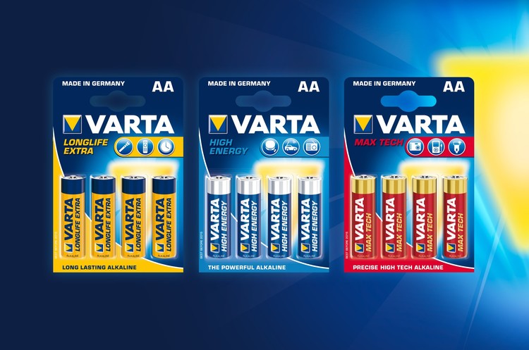
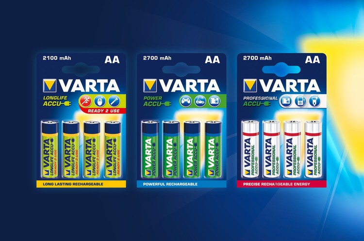
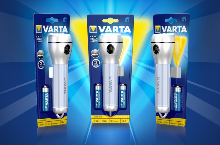
DESIGNS

RESULTS

20 MONTHS FROM KICK-OFF TO RE-LAUNCH

Not only has the Finish brand portfolio grown substantially over the past years, but its success in the market has improved considerably. Strong design principles applied throughout the portfolio make Finish easily recognisable in any market, any language. From Saudi Arabia to Japan, the same design and brand equity are applied across a clearly denoted tier structure and product offering.

CILLIT BANG

REVIVAL OF THE PURPOSEFUL PURPLE PUNCH

BACKGROUND

In 2004, the slogan “Bang! And the dirt is gone!” was heard for the first time. Ever since, the Reckitt Benckiser power-brand has won over consumers worldwide. Now available in 30 countries and in 5 varieties, Bang set new standards with its eye-catching comic book appearance, influencing the entire category of household cleaning products.

THE PROBLEM

The relaunch required an eye-catching and contemporary brand family to consolidate their market leadership within the household cleaning category.

THE SOLUTION

We took Cillit Bang’s evolutionary packaging design a step further – setting a revolutionary stage for brand values with a clear communications hierarchy and a powerful starburst visual. The revival of the “purposeful purple punch” ran through the graphic redesign all the way to structural development of the overall packaging.

DESIGNS

VARTA

MERGE OF CONSUMER, BRAND AND TECHNOLOGY-DRIVEN DESIGN

BACKGROUND

Varta is the market leader in Germany and the only manufacturer worldwide not producing in China. Varta celebrated 125 years of battery-expertise “made in Germany” in 2012.

THE PROBLEM

On the old packaging, VARTA‘s brand- and quality technology heritage was nearly invisible. Research showed that the consumers‘ focus was neglected and the information architecture was misleading. The relaunch from 2006-2009 was supposed to fix this and reposition Varta as understandable and approachable quality leader.

THE SOLUTION

To upgrade the VARTA brand, we created a new visual branding and information architecture. Supported by a contrasting pictogram, a clear didactic gets the unique benefits of each product across. We improved the differentiation of batteries vs. rechargeable cells and we defined a global design language, which avoids text, due to the fact that worldwide only one design is used.

BATTERIES & RECHARGEABLES
The premiumisation and emotionalisation of the brand has been enhanced by the concise
colour- and picture language. The clear information didactic with pictograms and key visuals
as differentiation works for rechargeable analogue to the battery-design. The new brand- and technology-driven design helps consumers identify the right product for their needs.

FLASHLIGHTS
The new icon system supports quick & easy international market implementation and communicates technology, performance, safety, and clarity, accordingly. By reducing the packaging to only one front blister and a fitted form, a plastic reduction of total 55% was gained.

DESIGNS

VANISH

RECKITT BENCKISER PRODUCT

RECKITT BENCKISER PRODUCT

PROBLEM SOLVING

BACKGROUND

As the UK's stain removal expert, Vanish produces stain removal products that eliminate almost every conceivable stain; even really tough dried-in stains that have been around for ages. With Vanish in your cupboard, you won't have to worry anymore about the damage stains and dirt can cause to your clothes and carpets, giving you more time to enjoy the more important things in life!

THE PROBLEM

Vanish Oxi Action acts up stain lifting and removal without damaging the fabric. It had been a decade since Vanish re-branded its packaging and it was looking outdated in comparison to its competition. 

THE SOLUTION

LBA proposed new packaging designs that would not only modernise the overall packaging and transmit efficiency, but that would also ensure consistency of the brand image across all Vanish products - a key underlying element to the company's organised brand architecture.

The bubbles on the packaging were amplified as they needed greater purpose. They also drive the perception of efficacy of the product. The master claim banner was re-allocated to the bottom of the packaging and further away from the key visual. This allowed the image to stand out further which acts a key element in increasing sales.

DESIGNS

vanish1.jpg

OLD DESIGN

OLD DESIGN

OLD DESIGN


NEW DESIGN:

Pink_Tub_500g.jpg

RESOLVE

STRENGTHEN RB'S RESOLVE

BACKGROUND

The successful US-American stain, carpet, and textile cleaning brand within RB’s broad range keeps your carpets clean and fresh. Resolve equips households in Canada, Peru and the USA with solutions from Carpet & Upholstery Cleaners and Stain Removers to Pet High Traffic Foam with ODOR.

THE PROBLEM

Target was to increase Resolve’s market share by enhancing brand impact, increasing brand value, and improving portfolio navigation. while also structuring the assortment.

THE SOLUTION

The brand mark was strengthened by adding dynamism and modernity. The jewel device behind the name mark emphasises the 

DESIGNS

BOSCH

LAWN & GARDEN

LAWN & GARDEN

VISIBLE AND UNDERSTANDABLE

BACKGROUND

Besides Bosch’s garden tools, the company produces power tools for home improvement enthusiasts and professional tools for the industry. The garden tools ensure effortless gardening that will help you enjoy your outdoor living area.

THE PROBLEM

Bosch wanted to address a new and wider audience with their tools. To attract also inexperienced gardeners the whole packaging has to be self-explaining and emotionally involving.

THE SOLUTION

After a detailed analysis of the competitive set in Germany and the UK, we revised the brand architecture and proposition to create an emotional, attractive product image by establishing a visual world that describes the application. We created a visible and understandable icon system for all target groups combined with a clear information structure and hierarchies on the packaging to soften access barriers for inexperienced gardeners.

EFFORTLESS GARDENING

The Product photography is expressive and modern, with lights emphasising on product quality and performance. Additionally, we paid special attention to the visual imagery of the usage area. With a sharp focus on the product performance subject and out of focus backgrounds or foregrounds, we created a unique perspective and depth. Thus, emotional gardening or, as we call it, the „BOSCH feeling“ comes alive.

DESIGNS