MERGE OF CONSUMER, BRAND AND TECHNOLOGY-DRIVEN DESIGN
BACKGROUND
Varta is the market leader in Germany and the only manufacturer worldwide not producing in China. Varta celebrated 125 years of battery-expertise “made in Germany” in 2012.
THE PROBLEM
On the old packaging, VARTA‘s brand- and quality technology heritage was nearly invisible. Research showed that the consumers‘ focus was neglected and the information architecture was misleading. The relaunch from 2006-2009 was supposed to fix this and reposition Varta as understandable and approachable quality leader.
THE SOLUTION
To upgrade the VARTA brand, we created a new visual branding and information architecture. Supported by a contrasting pictogram, a clear didactic gets the unique benefits of each product across. We improved the differentiation of batteries vs. rechargeable cells and we defined a global design language, which avoids text, due to the fact that worldwide only one design is used.
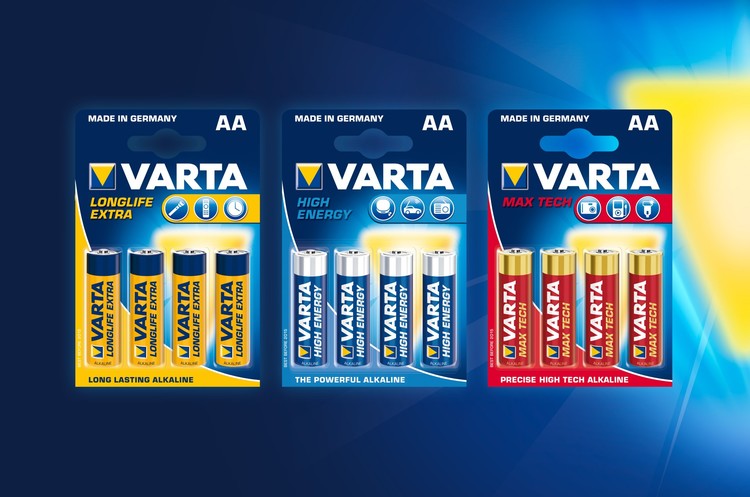
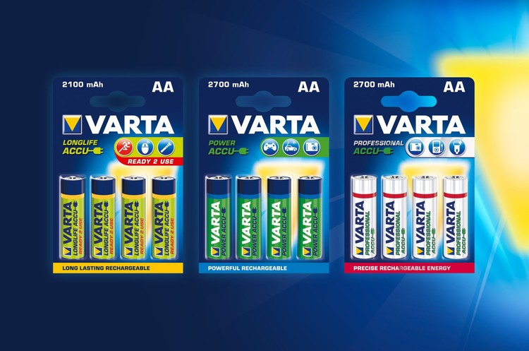
BATTERIES & RECHARGEABLES
The premiumisation and emotionalisation of the brand has been enhanced by the concise
colour- and picture language. The clear information didactic with pictograms and key visuals
as differentiation works for rechargeable analogue to the battery-design. The new brand- and technology-driven design helps consumers identify the right product for their needs.
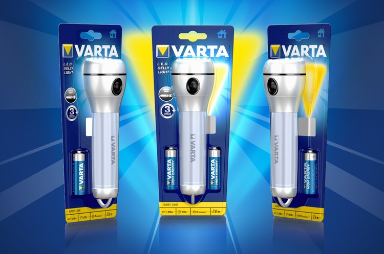
FLASHLIGHTS
The new icon system supports quick & easy international market implementation and communicates technology, performance, safety, and clarity, accordingly. By reducing the packaging to only one front blister and a fitted form, a plastic reduction of total 55% was gained.