Beverages

RAUCH

ATTENTION-GRABBING BRAND AND PRODUCT DESIGN

BACKGROUND

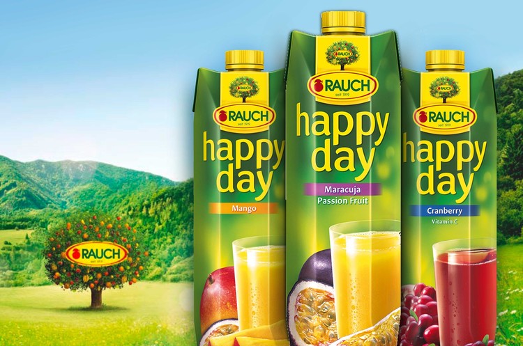
All efforts of the Austrian juice producer RAUCH are focused on one goal, namely to recognise and to fulfil the demands and desires of their target audience. Since 1919, RAUCH represents fruit, family, and nature.

THE PROBLEM

Since 2013 its slogan "Welcome to the Rauch-valley ..." invites the consumers and traders to get to know the products and brand world of RAUCH’s family business. Together with the company, we redesigned its umbrella branding and positioned it towards

THE SOLUTION

With the Rauch-tree we embedded a strong umbrella branding symbol, providing a common home for all products. The naturalness of the popular fruit juices is thereby strengthened and a strong visual for the brand communication is shaped.

FRESH & FRUITY
The new brand quality seal underlines the high quality standard of the products visually. In addition the new package design of “happy day” has everyone craving for fruit. The Color-coded and verbalized on the upper tab and in the middle let consumers easily navigate in the extensive range. The juicy fresh arrangement of glass and fruit ensures a high-impact presentation on the shelf and at the POS.

DESIGNS

RIBENA

GLAXOSMITHKLINE

GLAXOSMITHKLINE

RANGE DESIGN FOR ALL-THE-BERRYNESS

BACKGROUND

Ribena is a much loved English traditional brand of fruit-based uncarbonated and carbonated soft drink and fruit drink concentrate. Introduced in 1938 the original and most common variety contains real blackcurrant juice. The name derives from the botanical name “ribes”.

THE PROBLEM

We have been working closely with Ribena for 8 years, helping the brand to stay relevant to its target audience, in line with shifting brand strategies.

THE SOLUTION

To appeal teens while not alienating mums, we used cross-generational design, illustration styles and sensible tone of voice. Each range has an upbeat personality and unique shape.

DESIGNS

MELITTA

BARISTA

BARISTA

PREMIUM DESIGN FOR BARISTA QUALITY

BACKGROUND

The Melitta Caffeo Barista brings coffee variety to the home. With up to 18 coffee variaties, fine design, and an intuitive operating concept, preparing coffee is a pleasure for all senses.

THE PROBLEM

Our task was to create a new positioning and sustainable visual identity - Melitta’s coffee machines in Barista-quality reflecting the joy of coffee preparation combined with competence and enjoyment.

THE SOLUTION

The entire design of the Caffeo Barista focuses on the integrated presentation of the Melitta brand world and positioning. The product image benefits from the approachable world of enjoyment, from the harmonious colour concept, and from the new icon language that provide a comprehensible and quickly understandable information structure for interested users.

DESIGNS