Health and Beauty

TENA LIGHTS

TENA, AN SCA PRODUCT

TENA, AN SCA PRODUCT

LIFESTYLE WHERE IT'S LEAST EXPECTED

BACKGROUND

TENA, owned by SCA, is a leading global hygiene and forest products company, is the UK and Republic of Ireland's leading continence care brand, and is relied upon to improve the quality of life for those living or working with incontinence.  Absorbent bodyworn products have driven the evolution of hygiene standards in modern society and TENA plays an important role in this.

THE PROBLEM

TENA offers an extensive product range with its original brand image. However, a new category language was desired by the audience. The market demanded a more feminine-oriented product to resolve their feminine hygiene needs.

THE SOLUTION

A new product was developed: the Tena Lights range. This product helps and prepares women with unexpected menstrual cycle incidents. The packaging identity of Tena Lights reflects comfort and relief to counteract the feeling of embarrassment and stress most women feel in these situations. 

DESIGNS:


PENATEN

JOHNSON & JOHNSON PRODUCT

JOHNSON & JOHNSON PRODUCT

COMMUNICATING CARE & TRUST

BACKGROUND

We have accompanied Penaten for 30 years with 5 design generations. The growing consumer market and intensifying brand loyalty shows that design is able to communicate emotions, gentleness, confidence and competence.

THE PROBLEM

For decades, Penaten has stood out with its evolutionary designs, innovative products, and high quality.

THE SOLUTION

The key brand values of Penaten, “care & trust”, led our design work. With evolutionary steps we kept the brand character on a contemporary level. Global designs were adapted to local needs. The revised, reduced packaging design, and a clear assortment structure offer optimal orientation and relieve the buying decision.

DESIGNS

THE EVOLUTION OF PENATEN'S PACKAGING AND DESIGN

THE EVOLUTION OF PENATEN'S PACKAGING AND DESIGN

DIFFERENT CODES USED FOR DIFFERENT PRODUCT OFFERINGS

DIFFERENT CODES USED FOR DIFFERENT PRODUCT OFFERINGS

PRONAMEL

SENSODYNE, GLAXOSMITHKLINE

SENSODYNE, GLAXOSMITHKLINE

TO SHIFT PERCEPTION

BACKGROUND

The Sensodyne brand has maximum credibility for efficacy, but delivered a poor product performance and was perceived as an old-fashioned brand.

THE PROBLEM

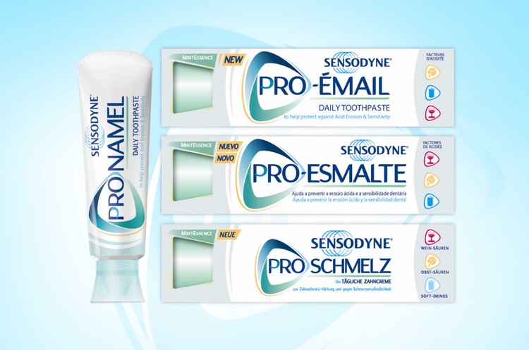
Pronamel was supposed to be the first global innovation for Sensodyne for many years. The product formulation was redesigned to tackle the growing problem of acid erosion, which is linked to factors in our modern lifestyle such as drinking wine, eating lots of fruit, and drinking sugary drinks.

THE SOLUTION

We developed a global brand identity, pack design template, and brand guidelines for the Pronamel brand built on existing Sensodyne design equities. The meme “pro” was chosen to communicate the product benefit across many languages and cultures. Relevant premium cosmetic cues were integrated in the design and communicate the product benefit with dynamism and modernity.

DESIGNS

BEBE

JOHNSON & JOHNSON PRODUCT

JOHNSON & JOHNSON PRODUCT

INSIGHT-DRIVEN PRODUCT AND DESIGN DEVELOPMENT

BACKGROUND

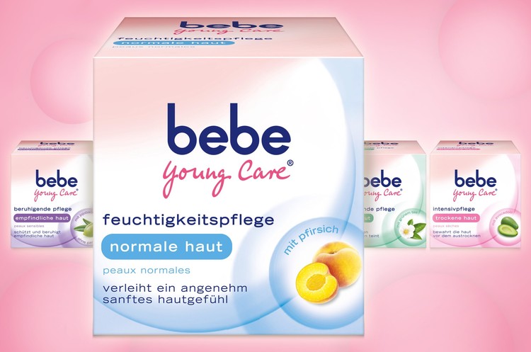
"bebe zartpflege" (child care) builds the nucleus of Johnson & Johnson's "bebe young care". Since the '90s, the brand has targeted adolescent girls and young women who have outgrown child care and want products tailored to their needs.

THE PROBLEM

Over the years, “bebe young care” has been committed to high quality values and high innovation rates. The design language should therefore emphasize the unique product benefit and enrich the brand.

THE SOLUTION

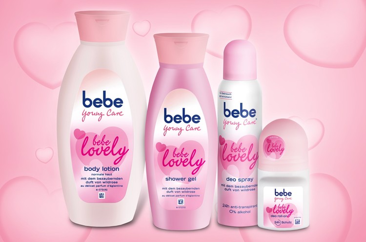
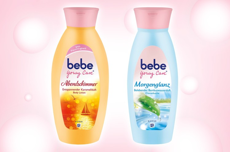
With soft colours, feminine shapes, charming illustrations, and playful typography united under one umbrella brand, "bebe young care" is becoming a real eye catcher and trendsetter in the drugstore shelf.

DESIGNS

SCHOLL

RECKITT BENCKISER PRODUCT

RECKITT BENCKISER PRODUCT

PROBLEM SOLVING

BACKGROUND

Scholl’s heritage and expertise as the world’s leading footcare brand has been built on decades of problem solving. As the brand grows in line with consumer needs, it is stretching into more ‘beauty regime’ activities.

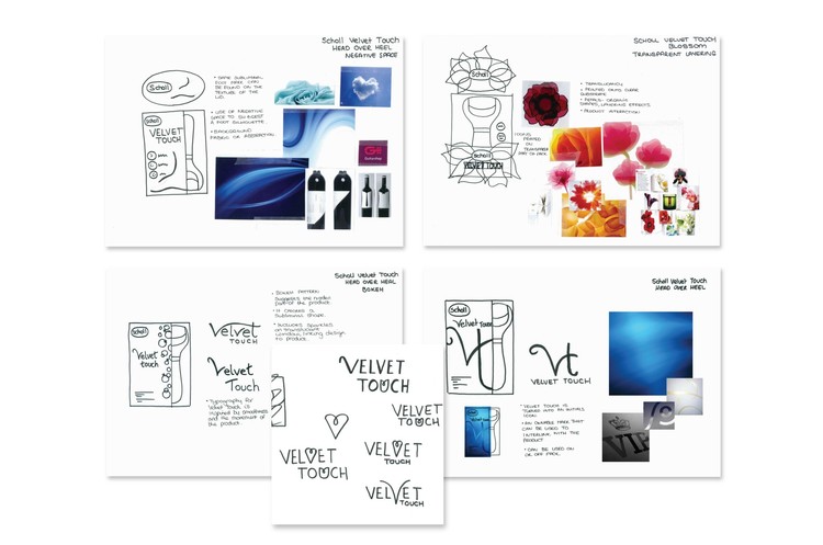
By bringing together new technologies and rich consumer insights the brand identified the value in an electronic foot file that delivers amazing, professional results at home. To launch this new product to a new consumer for the brand, RB briefed LBA to create a new sub-brand. This new identity would drive the launch of this new product, in new packaging, and with unlimited future development.

THE PROBLEM

The opportunity was to identify which of today’s equities will be relevant in the future and to leverage them for the new sub-brand identity. Creating this new sub-brand for Scholl challenged LBA to use a new set of brand values on a master brand that is experiencing fundamental change.

THE SOLUTION

The first step was to generate conceptual territories that could translate into design executions at a later date. Once these were aligned with the client team, the identity and packaging could be created and approved efficiently.

DESIGNS