IMPERIAL TABACCO
DEFINE BRAND ATTITUDE
BACKGROUND
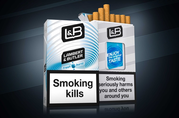
Launched in 1979, Lambert & Butler is currently Imperial Tobacco's largest UK brand. It has the highest market share of any full-flavour cigarette brand in the UK. Through cheeky, bold advertising, Lambert & Butler established strong ties to the hearts and minds of consumers.
THE PROBLEM
L&B will remain true to its strong heritage - 'a good smoke at the right price', but has to bear up in a high competitive market with a unique attitude and great look.
THE SOLUTION
A bold modern logo was created. The angled design demonstrates confidence and dynamism, bright colours and clear variant communication aiding standout and consumer understanding. Consumer engagement is enhanced through the use of tactile varnish within the lines across the range. Together with Imperial Tobacco we developed their brand world and guidance to guarantee dynamic visualisations of the brand values and to entertain consumers with unique and unseen POS material.
THE NEW BRITISHNESS
The lozenge is L&B’s iconic key visual. It can be used on its own to ensure consistent communication of the brand. The black and white colour scheme is a key equity of the logo and maintains the brand’s historic identity. With the bold communication panel it’s easy to communicate the brand variant or innovation on packaging. The white lines are a timeless classic and playful design element of the brand.