Tobacco

DAVIDOFF ID

INSPIRING IDEAS

BACKGROUND

When Zino Davidoff created his cigarettes he did it with an attitude as opposed to a demographic in mind. His attitude was elegant and refined, as well as contemporary and forward thinking.

This is our aim for Davidoff iD.

THE PROBLEM

New Davidoff iD offers a premium cigarette experience and the discovery of inspiring iDeas.

This is one of the most impactful global launches in the history of Imperial Tobacco, designed to extend Davidoff’s premium portfolio to a wider group.

THE SOLUTION

Davidoff iD is about discovering something new every day. iD also has a unique pack with innovative finishes, creative details, and lively colours that contrast with its modern black or stylish ivory. When the pack is opened, a range of different designs will appear. Behind each iD logo lies commissioned artwork from selected artists from all over the world.

DESIGNS

GOLDEN VIRGINIA

IMPERIAL TABACCO PRODUCT

IMPERIAL TABACCO PRODUCT

CONTEMPORARY INTERPRETATION OF NOBLE HERITAGE

BACKGROUND

Since 1877, Golden Virginia has been standing for high-quality, hand-picked tobacco. Through the years, competitive pressure increased and the competitive landscape has grown. Therefore, it was time for a relaunch for the number #1 RYO brand worldwide.

THE PROBLEM

Golden Virginia should be more firmly anchored in the RYO premium segment and should function at the same time as the umbrella brand for future line extensions.

THE SOLUTION

We created a contemporary interpretation of noble heritage by adding stronger premium cues and by adjusting the colours. The more unique & special logo is still a reminiscence to the past, but interpreted for the future. The artificial appearance gave way to an individual expression of craftsmanship, ruled by the sophisticated use of gold and the uniqueness of its logotype.

DESIGNS

DRUM

IMPERIAL TOBACCO PRODUCT

IMPERIAL TOBACCO PRODUCT

RELAUNCH OF THE DRUMNESS

BACKGROUND

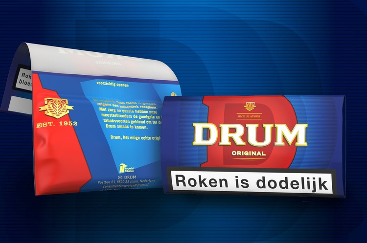
Drum, the world's number two roll your own tobacco brand after Golden Virginia, is currently available in more than 40 markets. By the way, every non-smoker recognizes the characteristic blue packet of Drum Tobacco, since it could be seen in the blockbuster Pulp Fiction as Vincent Vega's rolling tobacco of choice.

THE PROBLEM

Just like the brand, the packaging was expected to have an honest, approachable, and authentic look - recognisable solid blue for the loyal customers and contemporary interpretation to attract new adult customers.

THE SOLUTION

The distinctive red, but generic brand element (a stylized drum) was transformed into a unique key visual. The typical letter D became the vibrant heart of the design. While the learned colour coding was obtained, each DRUM pouch is resealable. Thanks to the flavour sealing material, the tobacco stays fresh significantly longer after opening. The longer strap ensures more freedom while rolling. And even after frequent use, the pack still looks tidy. Papers can be securely affixed to the packaging with paper sticker and are always ready at hand. 

DESIGNS

L&B

IMPERIAL TABACCO

IMPERIAL TABACCO

DEFINE BRAND ATTITUDE

BACKGROUND

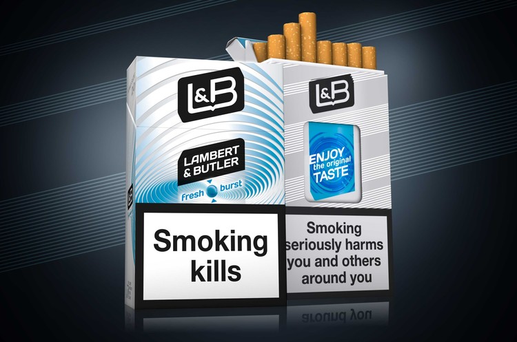
Launched in 1979, Lambert & Butler is currently Imperial Tobacco's largest UK brand. It has the highest market share of any full-flavour cigarette brand in the UK. Through cheeky, bold advertising, Lambert & Butler established strong ties to the hearts and minds of consumers.

THE PROBLEM

L&B will remain true to its strong heritage - 'a good smoke at the right price', but has to bear up in a high competitive market with a unique attitude and great look.

THE SOLUTION

A bold modern logo was created. The angled design demonstrates confidence and dynamism, bright colours and clear variant communication aiding standout and consumer understanding. Consumer engagement is enhanced through the use of tactile varnish within the lines across the range. Together with Imperial Tobacco we developed their brand world and guidance to guarantee dynamic visualisations of the brand values and to entertain consumers with unique and unseen POS material.

THE NEW BRITISHNESS

The lozenge is L&B’s iconic key visual. It can be used on its own to ensure consistent communication of the brand. The black and white colour scheme is a key equity of the logo and maintains the brand’s historic identity. With the bold communication panel it’s easy to communicate the brand variant or innovation on packaging. The white lines are a timeless classic and playful design element of the brand.

DESIGNS